Colour Theory in Web Design: More Than Just Looking Pretty
Colour is the first thing a visitor perceives, before they read a single word. It determines whether a website feels trustworthy, whether a button gets clicked, and whether a visitor stays or moves on. Yet colour choices on many web projects are made as an afterthought, based on personal taste rather than deliberate strategy.
The Psychology Behind Colour
Colours trigger emotions within milliseconds. This is not some vague concept. It is well researched. Blue communicates trust and stability. There is a reason banks, insurance companies, and tech firms rely on it. Red creates urgency and energy, which is why it appears so often in sales promotions and call-to-action buttons. Green represents nature, health, and growth. And black signals elegance and exclusivity.
But be careful: these associations are not universal. In Switzerland, white is associated with purity and minimalism, while in other cultures it represents mourning. Anyone communicating internationally should consider the cultural dimension of colour.
More important than individual colour associations is the overall picture. A colour palette needs to fit the brand, trigger the right emotions, and be applied consistently. A law firm dressed entirely in bright pink will struggle to convey professionalism, no matter how well-written the copy is.
Finding the Right Brand Colour
Choosing your primary colour is one of the most consequential design decisions you will make. It will appear everywhere: on your website, in emails, on business cards, across social media profiles. That is why it pays to decide consciously.
A good starting point is the question: what feeling should my brand evoke? Trust? Then explore the blue spectrum. Creativity? Purple and orange are compelling options. Natural authenticity? Earth tones and greens work beautifully.
Then comes differentiation. Look at which colours your competitors use. If everyone in your industry relies on blue, a deliberate contrast, a warm orange for instance, can set you apart significantly. Differentiation does not mean working against all conventions. But a thoughtful departure can generate attention.
Understanding Colour Systems
Professional web design never works with just one colour. It requires a system. The common structure consists of a primary colour that sets the main accent, one or two secondary colours for variety and hierarchy, neutral tones for backgrounds and body text, and an accent colour for interactive elements like buttons and links.
The 60-30-10 rule from interior design works remarkably well in web design too: 60 percent of the surface belongs to the dominant colour (often a neutral), 30 percent to the secondary, and 10 percent to the accent. This creates a harmonious look without being dull.
The 60-30-10 Rule
Tools like Coolors, Adobe Color, and Realtime Colors help in building harmonious palettes. Realtime Colors is particularly useful because you see your colour combination directly in a website layout, not just as abstract circles.
Coolors
Quick palette generation with a keystroke. Ideal for experimenting.
Adobe Color
Colour wheel with harmony rules. A pro tool for complex palettes.
Realtime Colors
Live preview in a website layout. Perfect for testing in context.
Contrast and Accessibility
A beautiful colour palette is useless if nobody can read the text. Contrast is not just an aesthetic question, it is a prerequisite for accessibility. The Web Content Accessibility Guidelines (WCAG) define clear minimum contrast ratios: 4.5:1 for normal text and 3:1 for large text.
This light grey text on a white background is barely readable for many users. Low contrast is a common mistake.
This dark text on a white background is clearly readable for every user, in every situation. This is how accessible contrast works.
Light grey text on a white background may look elegant, but for people with visual impairments (roughly 15 percent of the population) it is simply unreadable. Low contrast also fails in direct sunlight on a smartphone screen.
Check your colour combinations with the WebAIM Contrast Checker or directly in Figma with the Stark plugin. It takes seconds and can make the difference between a website that works for everyone and one that excludes a large portion of your audience.
Common Colour Mistakes
The most widespread mistake is using too many colours. When every section, every button, and every heading has a different colour, visual chaos results. The eye finds no resting point, and the visual hierarchy breaks down. Fewer colours, applied consistently, always look more professional than a rainbow.
Another classic error is using pure black (#000000) for text. It appears harsh and unnatural, especially on a white background. A very dark grey like #1a1a1a or #2d2d2d is easier to read and feels warmer.
Pure Black
This is text in pure black (#000000). The contrast against white feels harsh and tiring on the eyes.
#000000Dark Grey
This is text in dark grey (#2d2d2d). Softer, warmer, and more comfortable to read. The professional choice.
#2d2d2dIgnoring dark mode is also a mistake at this point. Your carefully chosen palette must work on dark backgrounds too. That does not mean simply inverting colours. It requires adjusted brightness values and often slightly modified hues.
Current Trends in Colour Design
In 2026, some interesting developments are taking shape. Muted, desaturated colours are replacing the bright neon palettes of recent years. Soft sage green, dusty rose, and warm beige tones dominate, especially for brands that want to communicate naturalness and authenticity.
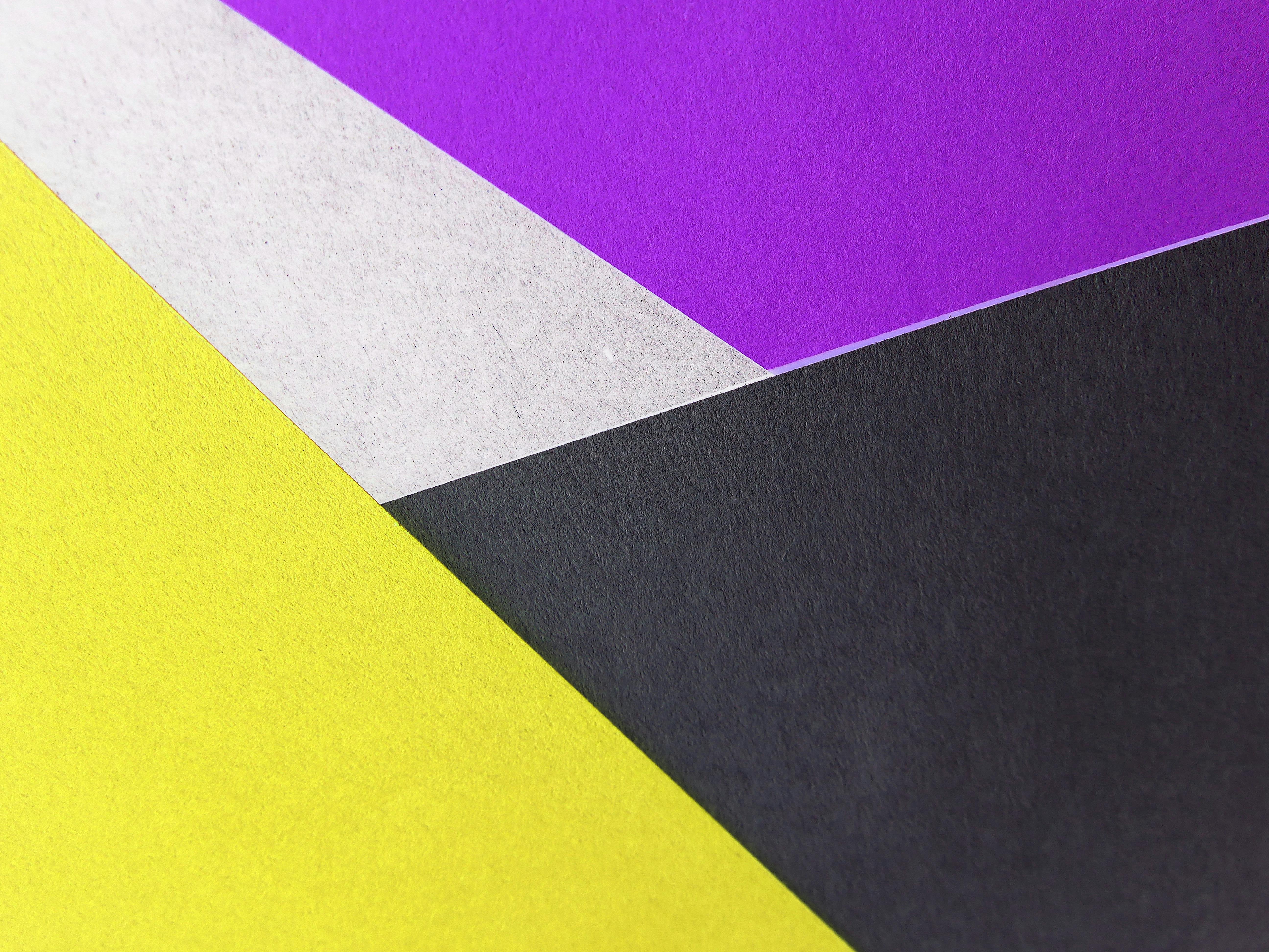
At the same time, there is a counter-trend: deliberately surprising colour combinations that break the grid. Electric blue next to terracotta, deep purple with mustard yellow. These bold palettes work when they are precisely dosed. In an otherwise restrained design, they create targeted focal points.
2026 Trending Palettes
Muted & Natural
Bold Contrasts
Gradients remain relevant but are becoming more subtle. Instead of Instagram-style rainbow gradients, gentle transitions between related tones create depth and dimension without being intrusive.
Conclusion
Colour is one of the most powerful tools in web design, and one of the most frequently underestimated. A well-considered colour strategy that combines psychology, accessibility, and brand values makes the difference between a website that simply exists and one that truly works. In my projects, I develop colour concepts that deliver measurable results. Learn more about my consulting and strategy services.
You might also like
Web Design Trends 2025: What Actually Matters
The most important web design trends for 2025: Bento Grids, micro-interactions, AI in design, dark mode and variable fonts. With practical tips.
Responsive Design: Why Mobile First Isn't a Trend
Over 60 percent of web traffic comes from mobile devices. Why mobile first is not a trend but a necessity, and how to implement responsive design right.
Hero Section in Web Design: Your First Impression Counts
The hero section decides in seconds whether visitors stay or leave. Five proven elements that make the difference on every website and boost conversions.